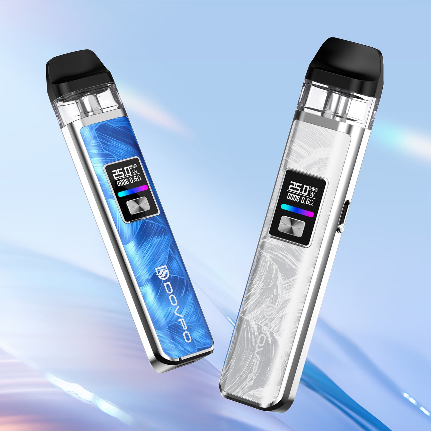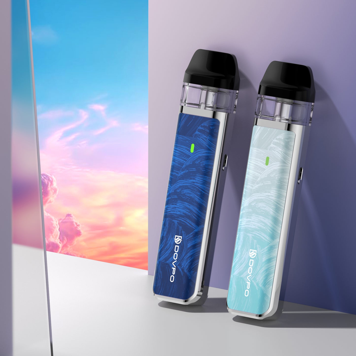
If you're good at hand-drawing or any kind of digital editing, such as photoshop or any other app, why not share with us your arts here & see if we're able to print them on the MVV II Mod! You can share your arts on Intagram with hashtag #MVVDOOR or send to lyn@dovpoecig.com and our team will collect all the designs & share them right here and or fans will vote for their favorite ones.
1. How to enter the game?
- Click here to download the template & put your design in the frame.
2. When the game starts & when it ends?
- From 5th Nov to 15th Nov.
3. What's the prize:
- a. The pattern that got most voted will be actually printed & the designer will get 2 MVV II Mods for free.
- b. 1 lucky winner will get rewarded a holiday gift box.
- c. 3 random lucky winners will get rewarded a free MVV II Mod. (Winners will choose from all designers & voters.)
Good luck, all!
Number 1 : 3 votes
Instagram : @cgf_725

Number 2 : 70 votes
Email : abxxxxx63@gmail.com

Number 3 : 15 votes
Email : whxxxxxrl@gmail.com

 Number 4 : 73 votes
Email : buxxxxxika@gmail.com

Number 5: 41 votes
Instagram : @penut2010

Comment on which one you like best ,Thank you .


Comments
Number 3
Number 4
No.3 looks the best for me. the design is simple compared to others but it’s in a different category on its own. but maybe changing the background to black and replacing the outline colors with white would add a “bold” feel to it.
no. 4 is cool but it’s very similar to the past designs that you’ve had before. it’s good to shake things up a bit sometimes.
no. 1 is decent but the whole Squid game trend is already starting to die.
no. 2 looks like it was made with a lot of effort but it has a lot of things going on. the color scheme is tacky and with the design itself; it can blend very well in the background of where every you put it… which makes it hard to stand out.
no 5 is very well drawn but then again, just like the No.2. the color scheme of Brown is something to avoid in the world of design.
all in all, every design looks great, but no 3 takes my vote for keeping it “real” / original.
no. 5 coming in close though.